CHURCH OF OTAGO
In November 2021, I participated in a rebranding project for the First Church of Otago during my placement at David Henderson Design Agency (Belfast, Northern Ireland, UK). This collaborative effort involved team members individually developing design concepts to present to the client. While my design was not selected for the church’s main visual identity, the client chose my logo for their Friends of First Church society group. This case study highlights the branding process for Friends of First Church, from concept to completion, showcasing how the visual identity was tailored to reflect the group's mission while aligning with the overarching vision of the First Church of Otago.
SKETCHES
The sketching phase explored various styles to embody the church’s vision, guided by a client-provided brief. The client emphasized incorporating architectural elements of the church while maintaining a "classy" and "modern" aesthetic. Drawing inspiration from key features such as the spire, spiral, window panels, and overall structure, the designs sought to reimagine how the church could be visually represented. Each concept carried its narrative, inviting the audience to interpret the essence of the church in unique ways.
In addition to adhering to the brief, I experimented with modernizing the designs. This included creatively integrating the letters "O" and "C" from "Otago Church" into dynamic interactions. Ultimately, circular motifs and geometric shapes became pivotal in crafting distinctive versions, combining tradition with a contemporary edge.


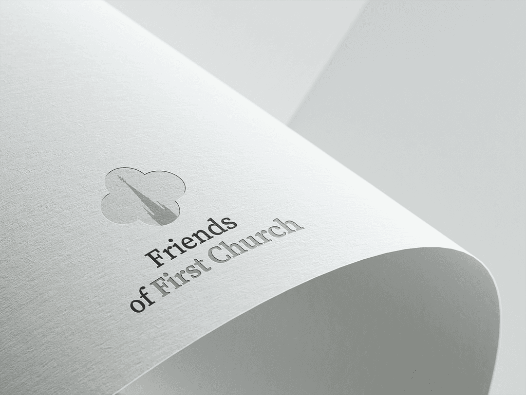
OUTCOME
After a few trial and errors, the outcome surface with a simplistic but detailed monogram. The monogram include a four rounded geometric shape taken from details of the church. Within it, the spiral of the church showcases intimate details that make up the First Church of Otago. The monogram and wordmark successfully highlights the twist between classiness and a modern outlook. It is effective to interpret ensuring it is approachable, inviting and reflective.
VISUAL IDENTITY
The branding for Friends of First Church is anchored by two primary colours and the 'Source Serif Pro' typeface. The monogram's elegance is enhanced by the traditional and timeless appeal of the typeface, creating a cohesive flow throughout the brand's design. The chosen colour palette, inspired by the church's website, reinforces this timeless aesthetic. These shades were carefully selected for their enduring visual appeal, striking a balance between strength and softness to convey a sense of both power and approachability. This combination ensures that the brand remains visually harmonious and reflective of the church's values.
Typography
SemiBold
Colour Palette
Primary Colour
Otago Gold
HEX: B5A88F
RGB: 181 168 143
CMYK: 0 7 21 29
Primary Colour
Otago Grey
HEX: 515151
RGB:81 81 81
CMYK: 0 0 0 68
OTAGO'S ILLUSTRATION
Lastly, as a side-project, I was also given an opportunity to use my illustration skills to capture the essence of the church’s architecture. I developed a line illustration of the church’s front entrance. It was long process as it was vital to spot every individual detail where the words ‘respect’ and ‘proud’ can be embraced.

Final Notes:
Participating in this project was an incredibly rewarding experience, especially as it marked my first opportunity to create a brand for a real client. The process was both challenging and fulfilling, and when the mockups were delivered, the client’s positive reception, without any criticisms, significantly boosted my confidence in my design abilities. It reinforced my belief that I am progressing as a digital designer. Collaborating with my team was equally impactful; their trust in my skills and their willingness to guide and include me in such an important project helped me understand my potential and clarified where my design strengths lie. This experience has been a pivotal moment in my journey, motivating me to continue developing and refining my craft.