An app created for pregnant women with eczema

An app created for pregnant women
with eczema

EXPERTISE

Mobile App Design
and Branding

ROLE

UX/UI Designer

OVERVIEW

OVERVIEW

OVERVIEW

Between September 2022 and May 2023, I developed an application known as Flare as my capstone project at Ulster University (Interaction Design). The function of Flare is to aid in managing eczema in expectant women.

Between September 2022 and May 2023, I developed an application known as Flare as my capstone project at Ulster University (Interaction Design). The function of Flare is to aid in managing eczema in expectant women.

BACKGROUND

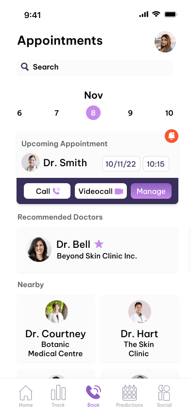
Flare is an innovative app designed to support women managing eczema during pregnancy while assisting healthcare professionals in monitoring their patients. Pregnancy often brings significant hormonal changes, which can trigger eczema flare-ups for the first time, affecting daily life. A lack of clear guidance on managing these symptoms can lead to confusion and stress for expecting mothers. Severe cases may require frequent, in-person consultations, which can be challenging to coordinate and place additional strain on healthcare systems. Flare addresses these challenges by offering a user-friendly solution that simplifies symptom tracking and supports effective communication between patients and practitioners, ultimately enhancing care for both parties.

HOW DOES FLARE WORK?

Flare is designed to assist users by utilising an AI tracker to detect variations in symptoms related to eczema and pregnancy. While it does not provide medical diagnoses, it serves as a reliable guide, identifying and predicting symptoms in advance. Inspired by features from apps like Flo, Flare offers users insights into how upcoming symptoms may impact their daily lives, including sleep and diet patterns.

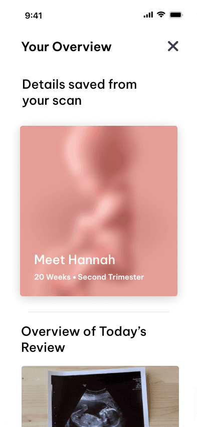
Additionally, Flare includes functionality for tracking pregnancy milestones, allowing users to input ultrasound details and view their baby’s development on an interactive map. These features provide both predictive support and a personalized journey for users navigating the challenges of pregnancy and eczema.

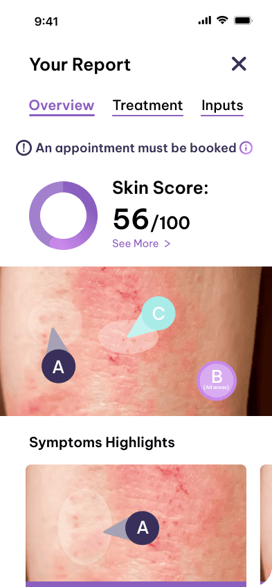
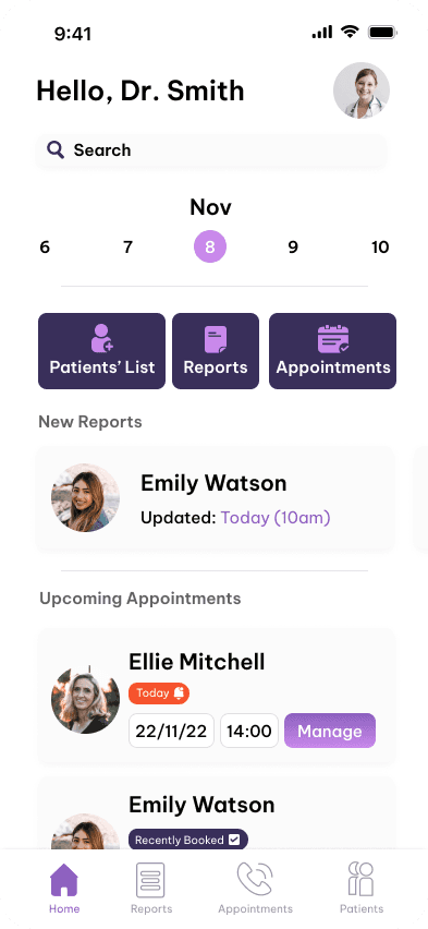
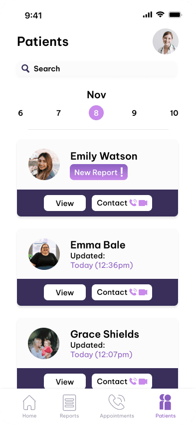
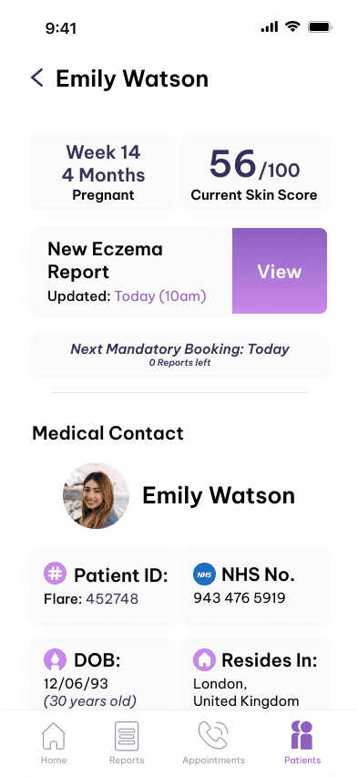
Furthermore, a dedicated section for doctors enables them to monitor patients' symptoms and pregnancy journeys effectively. Using diagnosis reports generated from user-submitted information, healthcare providers can identify new or concerning symptoms and address them promptly.

PROCESS

PROCESS

PROCESS

This category details the approach taken during the project.

RESEARCH AND THE CHALLENGES

Initially, the app was not designed for pregnant women; it was intended as a general-use eczema product. However, during competitor analysis, I discovered similar ideas already existed. This led me to re-evaluate and focus on a unique angle: eczema in pregnant women. Through research, I found that hormonal changes during pregnancy can trigger eczema, leaving women unsure of how to manage the condition. Flare was developed to guide them, addressing a largely overlooked topic and catering to their specific needs.

I conducted surveys targeting pregnant women, primarily through Facebook groups, but faced challenges due to posting restrictions, limiting responses and insights. Despite this, the collected data informed the creation of two user personas: a pregnant woman (patient) and a doctor (obstetrician). These personas highlighted the importance of stress-free condition management for patients and effective monitoring tools for doctors. The insights shaped Flare into a solution addressing these key challenges.

The research of Flare can be accessed below:

SKETCHES:

Each wireframe was meticulously designed to create a clean, intuitive layout structure. The priority was to avoid overwhelming users with unnecessary elements, ensuring content remained easily digestible. Some screens underwent multiple iterations to optimise navigation, enhance visual elements, and refine interactive touchpoints. This process was guided by encouraging seamless user engagement and creating a harmonious balance between functionality and design.

SKETCHES

Each wireframe was meticulously designed to create a clean, intuitive layout structure. The priority was to avoid overwhelming users with unnecessary elements, ensuring content remained easily digestible. Some screens underwent multiple iterations to optimise navigation, enhance visual elements, and refine interactive touchpoints. This process was guided by encouraging seamless user engagement and creating a harmonious balance between functionality and design.

PROTOTYPE

Every wireframe is thoughtfully designed with a balanced layout, ensuring clarity and ease of use, whether featuring CTAs or visual components. Both the Patients' and Doctors' sections are easily accessible, with content intuitively organized to avoid confusion and enhance user confidence throughout their journey.

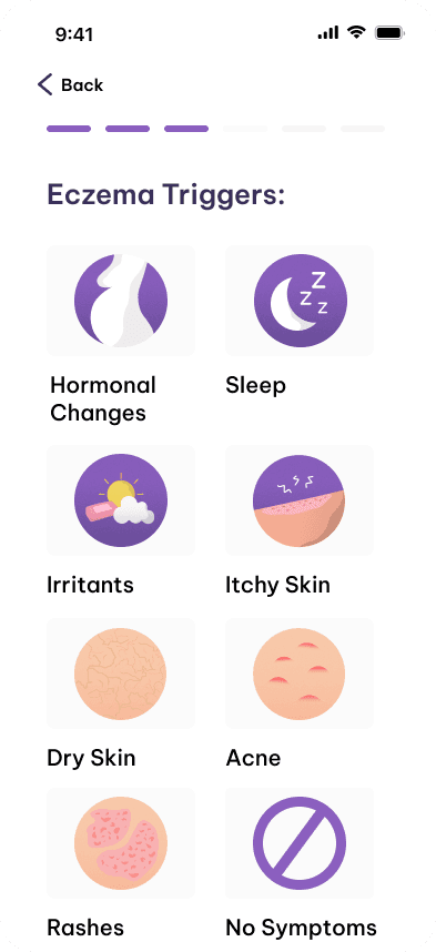
The Patients' Section:

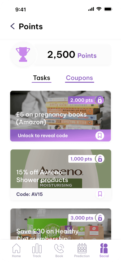
The Patients' section is designed to be highly engaging, offering users a wide range of personalized services. It prioritizes creating a sense of care and connection by tailoring content to individual needs, encouraging users to actively log their information daily basis. This personalized approach not only enhances user satisfaction but also fosters a deeper sense of trust and support.


The Doctors' Section:

The Doctor's section is thoughtfully organized to support medical practitioners in managing patient care efficiently. With intuitive access to patient data and actionable insights, it helps streamline the process of identifying and addressing medical concerns. This structure promotes effective communication and fosters a collaborative relationship between doctors and their patients.

The prototype process of Flare has followed an unforgettable milestone in its development journey.

The prototype effectively highlighted the app's key features and demonstrated how they cater to pregnant women managing eczema and the healthcare practitioners supporting them. Its core objective was accessibility, ensuring a seamless and user-friendly experience that positively impacts users' lives. By focusing on creating a supportive and efficient mobile application, Flare aims to enhance the well-being of its users throughout their pregnancy journey, offering a solution that is both meaningful and impactful.

Working on Flare has surfaced as one of the most promising and versatile works I’ve accomplished. It was challenging to base my app on this subject, nevertheless, I overcame these issues by seeing it as an insightful learning curve which can improve over time.

It has been an enjoyable ride. In the foreseeable future, I can see Flare evolving to become more prominent than it currently is. It is an app that has no limits in benefiting the user’s needs.

BRANDING

Before developing the app, establishing a strong brand identity was a top priority to effectively convey Flare’s core focus. The goal was to highlight Flare’s purpose by visually showcasing its commitment to supporting users with care and empathy.

BRANDING

BRANDING

Before developing the app, establishing a strong brand identity was a top priority to effectively convey Flare’s core focus. The goal was to highlight Flare’s purpose by visually showcasing its commitment to supporting users with care and empathy.

SKETCHES:

During the concept sketching phase, my approach centered on integrating the themes of "pregnancy," "fetuses," "eczema," and "flare-ups" into the design. By exploring these concepts through geometric shapes and abstract forms, I developed a variety of styles. I ensured each design captured the essence of Flare while maintaining a unique and modern aesthetic. Ultimately, I selected concepts that were both visually striking and clearly communicated the brand's core elements.

SKETCHES

During the concept sketching phase, my approach centered on integrating the themes of "pregnancy," "fetuses," "eczema," and "flare-ups" into the design. By exploring these concepts through geometric shapes and abstract forms, I developed a variety of styles. I ensured each design captured the essence of Flare while maintaining a unique and modern aesthetic. Ultimately, I selected concepts that were both visually striking and clearly communicated the brand's core elements.

THE OUTCOME

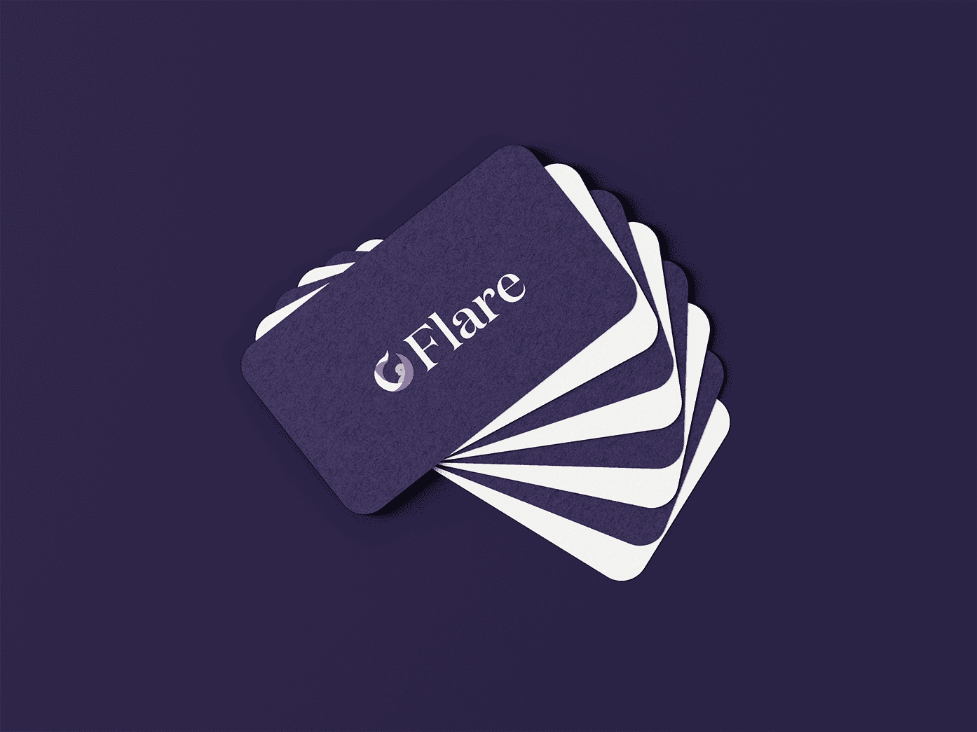
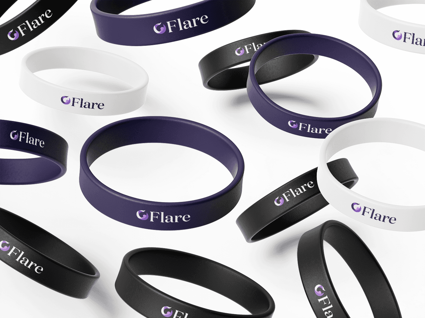
The final logo design features a baby enclosed within an open circle, symbolizing the womb. The circle’s colorful strips represent eczema "flare-ups," capturing the app’s core focus. Flare’s brand identity conveys the qualities of being helpful, hopeful, and influential. It addresses key pain points with the promise of overcoming them confidently. This identity is reflected across three distinctive background variations, further enhancing its versatility and emotional resonance.colourful


VISUAL IDENTITY

Between September 2022 and May 2023, I developed an application known as Flare as my capstone project at Ulster University (Interaction Design). The function of Flare is to aid in managing eczema in expectant women.

Typography

VISUAL IDENTITY

Flare is demonstrated by the typeface Domaine Display and embraced with five different colours such as violets, pinks & teals. The brand is not overwhelming to look at as it radiates comfort and lightness.

Typography

Domaine Display

Domaine


Display

SemiBold

AaBbCcDdEeFfGiHhIiJjKkLl
MmNnOoPpQqRrSsTtUuVvWwXxYyZ

AaBbCcDdEeFfGiHhIiJjKkLl
MmNnOoPpQqRrSsTtUuVvWwXxYyZ

AaBbCcDdEeFfGiHhIiJjKkLl
MmNnOoPpQqRrSsTtUuVvWwXxYyZ

Colour Palette

Primary Colour

Space Cadet

HEX: 392F5A

RGB: 57 47 90

CMYK: 37 48 0 65

Primary Colour

Amethyst

HEX: 8B5FBF

RGB: 139 95 191

CMYK: 27 50 0 25

Primary Colour

Bright Lilac

HEX: C989EB

RGB: 201 137 235

CMYK: 14 42 0 8

Secondary Colour

Powder Blue

HEX: C4F2EF

RGB: 196 242 239

CMYK: 19 0 1 5

Secondary Colour

Celeste

HEX: A9EBE7

RGB: 169 235 231

CMYK: 28 0 2 8

Final Notes:

Developing Flare has emerged as one of my most rewarding and versatile projects. While challenging, focusing on this subject provided an enriching learning curve, enabling me to overcome obstacles and grow from the experience. A great deal of thought and effort went into ensuring every aspect of Flare's design met the needs of its target audience. Guided by invaluable mentorship and constructive critiques, the process yielded proud moments for me as a designer.

But wait, there's more to see!
Discover more about Flare's process here:

LAUNCH STRATEGY

See how Flare would be campaigned

NOTION BLOG

Research and Design Development blog

COLOPHON REPORT

Behind the scenes of Flare

FINAL YEAR PRESENTATION

My final year presentation on the process of Flare